 |
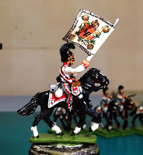
| Sharply dressed! |
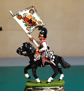
Fortunately, there is just enough paint and varnish to blunt the edges of the flag and reduce the risk of major blood loss to anyone attempting to pick him up. He'd still be quite effective as a letter opener, however.
I'm quite tempted to have a go at a full-scale infantry flag using this technique. I reckon it'd work quite well with anything that didn't have to be too symmetrical.
The next post will feature the officer and the trumpeter. The latter really did lead to blood loss!
WM
 |
| ....but not too sharp! |
Splendid! A gorgeous lighthouse for your troops on your future battlefields!
ReplyDeleteThank you, Phil. Yes, it did come out a bit bright, didn't it! Hopefully the future battlefields won't be too far off.
DeleteExcellent work - you have a steadier hand than me , Tony
DeleteCheers, Tony. The flag was surprisingly simple. It was the endlessly fiddly saddlery that was the frustrating bit.
DeleteYou've made a superb job of that. The flag is great and as you say the saddlery is surprisingly tricky on these figures, not to mention the buttons!
ReplyDeleteStunning paint job Matt, that is something really quite special!
ReplyDeleteThat flag is lovely! Well done.
ReplyDeleteExcellent work, lovely figure and beautiful flag, looks like rest of the unit is complete (in background)?
ReplyDeletePaul
Thank you all
ReplyDeleteIan - Quite so! I'll be very happy to finish this lot!
Paul - I wish it was, but alas it's just the first squadron. This regiment has taken so long that I had to get them out again to remind myself how to paint them!
'Lee - Very kind of you to say so. I can't help thinking that he looks like he's selling oranges.
Anonymous - Thanks Mister!
Super figure Matt, he looks really good going forward. I lve the way you say that the flag was surprisingly simple...........doesn't look simpke from here!
ReplyDeleteCheers, Roy. The folds and creases do quite a good job of obscuring the wonkier bits!
DeleteThat is very nice indeed, well worth the effort. So, how many will be in the final unit...32 surely...8-)
ReplyDeleteIt feels like it, DC!
DeleteSuperb, Matt - really very impressive - not only that, but the flag is actually beautiful - how you can do that when the flag is attached to the man and blowing a bit in the wind is beyond me. Excellent.
ReplyDeleteThank you Foy.
DeleteHaving the flag firmly attached to something was actually an advantage. The folds did make things a little trickier, however. It wouldn't work with Bavarian lozenges!
The green and orange is very 1970s, is it not! My mum had wallpaper a bit like that in the kitchen.
I am in awe of your newly painted standard. It reminds me that I need to order more from the Flag Dude in time for Salute 2016.
ReplyDeleteI’m empathising over the blood loss too, but quietly relieved that I’m not the only idiot who still hasn’t learned why you don’t let the knife blade slip over that sabre hilt into the inviting soft flesh below. Heigh ho.